Advent of CSS 2024 - Day 2 - Toggle
January 1, 2025
Nearly after trying to do some advent of CSS 2024 while making the toggle from scratch with HTML and CSS, I see that I have missed a thing that is important that a frontend engineer needs to focus on - Accessibility.
Advent of CSS 2024 - Day 2 - Toggle
Requirement:
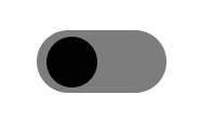
- Unchecked State
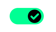
- Checked State
Hex color using:
Green - #02ff94Gray - #7d7d7dResult:
Rethink about accessibility
For a long time, working as a React - Next JS developer, which a bunch of libraries like Ant Design, Material Design, Shadcn… I can build fancy components that have a lot of animation, state updates, and logic handling in the React ways. I think I understand how to build the component now. Until I start to make the advent of CSS 2024
Everything collapsed when I figured out that it was not as easy as I thought. A toggle - a simple component, I can do that with state change and then update UI with state and div in React. But, how can I do that in HTML and CSS only?
For the first time build it, I simply used div and input.
<div class="switch"> <input type="checkbox" /> <div class="switch-track"> <div class="switch-indicator"></div> </div></div><style> input { appearance: none; } /* input check css ... */</style>Looks not bad. It’s work.
And then, after I referenced another solution with fully accessibility. It looks like this.
Do you see the difference? Yes, we use the span instead of div and have a label for it.
<label class="switch" for="uniqueID"> <input type="checkbox" id="uniqueID" /> <span class="switch-track"> <span class="switch-indicator"> ...icon </span> </span> </span> The toggle label</label><style> input { clip: rect(0 0 0 0); clip-path: inset(50%); height: 1px; position: absolute; left: -9999px; } /* input check css ... */</style>Hmmm. Why is the structure so different? Here we come with the accessibility.
Accessibility for tag
label - the form control accessibility
When only using div, I figured out that if I use only div, I can not handle clicking the title of that checkbox by using only CSS. Must use JS to handle click event to change the state for input. For the definition of mdn web doc:
Associating a
<label>with a form control, such as<input>or<textarea>offers some major advantages:
- The label text is not only visually associated with its corresponding text input; it is programmatically associated with it, too. This means that, for example, a screen reader will read out the label when the user is focused on the form input, making it easier for an assistive technology user to understand what data should be entered.
- When a user clicks or touches/taps a label, the browser passes the focus to its associated input (the resulting event is also raised for the input). That increased hit area for focusing the input provides an advantage to anyone trying to activate it — including those using a touch-screen device.
So that it helps us to trigger the input inside. Helping increase the UX for a small element to click.
And don’t forget 2 things when using label:
- The
idfor the input that trigger focus- The content of the label
We have done with the accessibility, but how about the input?
appearance - the important aspect of a screen reader
We need to hide the current input to show our custom element css for the toggle. We have some ways to hide:
- Display: none;
- Visibility: hidden;
- Appearance: none; That came to my mind when I first wanted to hide something. But they come with some disadvantages:
- Display: none: The element is not visible in the DOM, the screen reader can not read it.
- Visibility: hidden: It keeps the DOM, but also keeps all the sizing of the element that causes a blank space in the UI.
- Appearance: none: It keeps the DOM, visible to a screen reader, and removes the style. But the DOM element still takes place there. You will see it when use flex, it will count that input DOM.
That’s why we came to the final solution:
input { clip: rect(0 0 0 0); clip-path: inset(50%); height: 1px; position: absolute; left: -9999px;}In this way, we can hide the input element, still keep the DOM, and not affect the parent element layout.
And for the rest. We can style the toggle as long as we like.
Full code:
102 collapsed lines
<label class="switch" for="uniqueID"> <input type="checkbox" id="uniqueID" /> <span class="switch-track"> <span class="switch-indicator"> <span class="checkmark"> <svg viewBox="0 0 61 45" xmlns="http://www.w3.org/2000/svg"> <path fill-rule="evenodd" clip-rule="evenodd" d="M48.7498 2.28142C51.3913 -0.359957 55.6739 -0.359921 58.3153 2.28153C60.7556 4.72181 60.9404 8.55699 58.8749 11.2134L58.8041 11.3044L58.3963 11.7663L27.5701 42.5925C25.1298 45.0327 21.2946 45.2175 18.6382 43.152L18.5472 43.0812L18.0853 42.6734L2.63175 27.2198C-0.00973761 24.5784 -0.00973773 20.2957 2.63175 17.6542C5.07203 15.2139 8.9072 15.0291 11.5636 17.0946L11.6546 17.1654L12.1164 17.5731L22.7871 28.2419L48.7498 2.28142C48.7498 2.28138 48.7497 2.28146 48.7498 2.28142Z" ></path> </svg> </span> </span> </span> Toggle Label</label>
<style> .switch { --thumb-size: 48px; --checkmark-size: calc(var(--thumb-size) * 0.6); --padding: 6px; --track-width: 120px; --track-height: calc(var(--thumb-size) + 2 * var(--padding)); --track-background: #7d7d7d; }
.switch { display: flex; align-items: center; border-radius: 100px; position: relative; }
input { clip: rect(0 0 0 0); clip-path: inset(50%); height: 1px; width: 1px; position: absolute; left: -9999px; white-space: nowrap;
&:not([disabled]):active + .switch-track, &:not([disabled]):focus + .switch-track { outline: 2px solid #000; } &:disabled + .switch-track { cursor: not-allowed; opacity: 0.7; } }
.switch-track { display: flex; padding: var(--padding); width: var(--track-width); height: var(--track-height); border-radius: 100px; cursor: pointer; position: relative; background-color: var(--track-background); transition: 0.3s ease-in-out; margin-right: 12px; }
.switch-indicator { display: flex; width: var(--thumb-size); height: var(--thumb-size); background-color: #000; border-radius: 50%; align-items: center; justify-content: center; transition: 0.2s ease-in-out; }
input:checked + .switch-track { background-color: #00ff94; transition: 0.3s ease-in-out; }
input:checked + .switch-track .switch-indicator { transform: translateX(calc(var(--track-width) - var(--track-height)));
.checkmark { opacity: 1; transition: opacity 0.2s ease-in-out; } }
.checkmark { display: inline-flex; transition: opacity $speed ease-in-out; width: calc(var(--thumb-size) - 16px); height: calc(var(--thumb-size) - 16px); fill: #00ff94; opacity: 0; transition: opacity 0.3s ease-in-out; }</style>