Advent of CSS 2024 - Day 1 - Photo Gallery
December 31, 2024
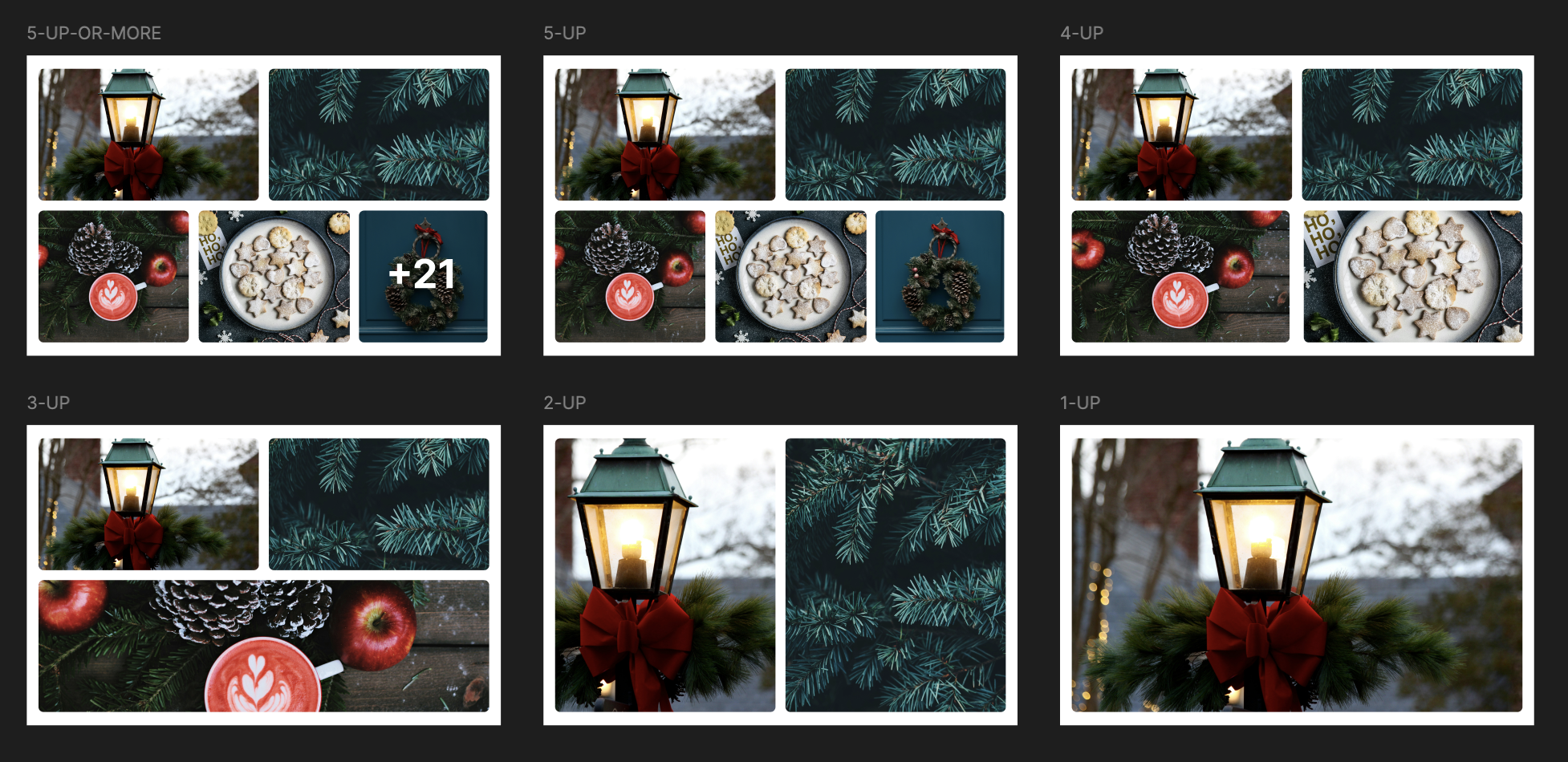
Day 1 - Photo Gallery
For today’s challenge, we’ll build a photo gallery card, similar to Facebook:
Coding
To make this only for html and css, I will use the :has() and counter-increment properties.
First let create a html:
<div class="container"> <div class="image"> <img src="/images/image-1.jpg" alt="Photo 1" /> </div> <div class="image"> <img src="/images/image-2.jpg" alt="Photo 2" /> </div> <div class="image"> <img src="/images/image-3.jpg" alt="Photo 3" /> </div> <div class="image"> <img src="/images/image-4.jpg" alt="Photo 4" /> </div> <div class="image"> <img src="/images/image-5.jpg" alt="Photo 5" /> </div> <div class="image"> <img src="/images/image-6.jpg" alt="Photo 6" /> </div> </div>:has() selector
To solve this challenge we will use the :has() selector to change the layout by the number of photos that we have.
  .container {    display: grid;  }
  .container:has(.image:nth-child(2)) {    grid-template-columns: repeat(2, 1fr);  }
  .container:has(.image:nth-child(3)) {    grid-template-columns: repeat(2, 1fr);    .image:nth-child(3) {      grid-column: span 2;    }  }
  .container:has(.image:nth-child(4)) {    grid-template-columns: repeat(2, 1fr);    grid-template-rows: repeat(2, 1fr);    .image:nth-child(3) {      grid-column: span 1;    }  }
  .container:has(.image:nth-child(5)) {    grid-template-columns: repeat(6, 1fr);    .image:nth-child(1),    .image:nth-child(2) {      grid-column: span 3;    }    .image:nth-child(3),    .image:nth-child(4),    .image:nth-child(5) {      grid-column: span 2;    }  }
counter-increment property
I rarely use this property, as a React developer, I already have an index to calculate for the number of photos that over the limit. And by this challenge, it’s a good way to learn about this property.
  .image {    // ...    counter-increment: image-counter;  }
  /* More than 5 photos */  .container:has(.image:nth-child(6)) {    counter-set: image-counter -5;    counter-reset: image-counter;
    .image:nth-child(5) {      grid-column-start: 5;      grid-column-end: span 2;      grid-row-start: 2;    }
    .image:nth-child(n + 6) {      grid-column-start: 5;      grid-column-end: span 2;      grid-row-start: 2;      img {        display: none;      }    }
    .image:last-of-type::after {      content: "+" counter(image-counter);      position: absolute;      inset: 0;      display: flex;      justify-content: center;      align-items: center;      background-color: rgba(0, 0, 0, 0.5);      color: white;      font-size: 2rem;      font-weight: bold;    }  }
Result:

Feel free to contact me if you have any questions or suggestions.